Client
Platform
Tools
Role
timeline
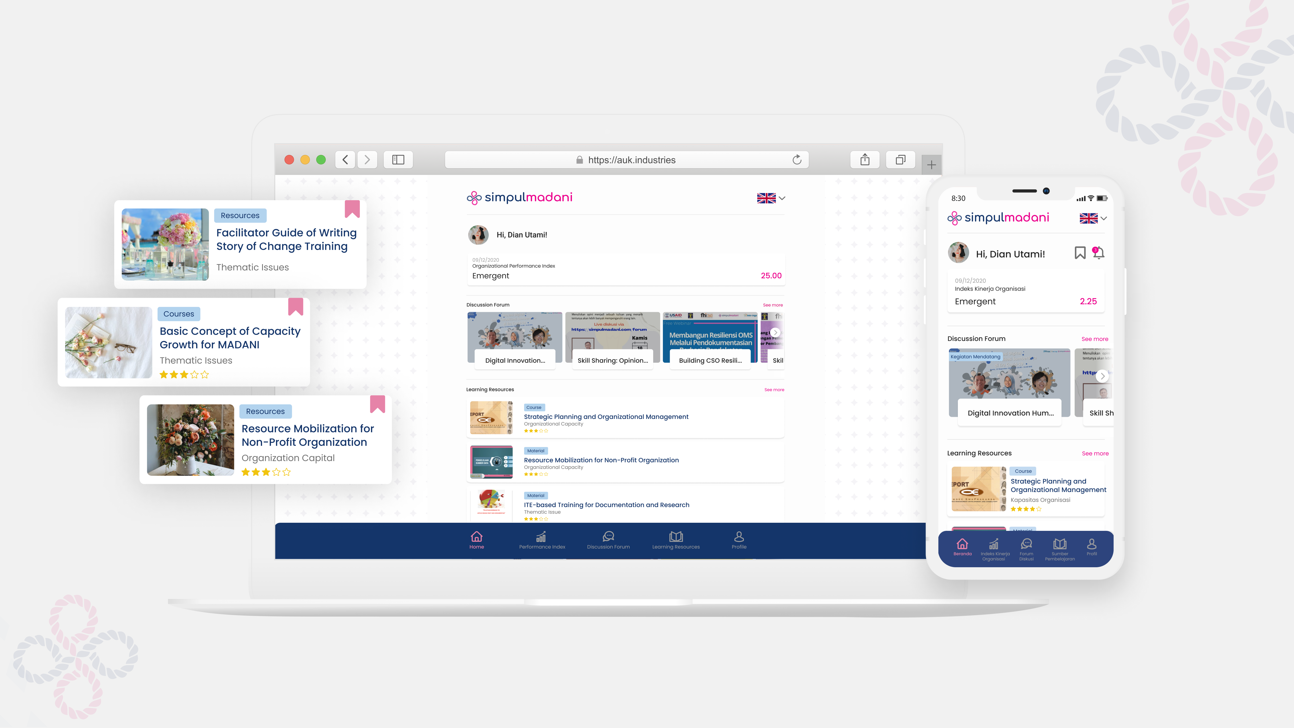
Simpulmadani is an integrated learning center for Civil Society Organizations (CSOs) in Indonesia, developed by AtmaGo with support from USAID.
The Simpulmadani platform, an open-source innovation and knowledge hub, was developed by FHI360 under the USAID-funded MADANI Civil Society Support Initiative. Designed by Saraswati, it is now managed by KM4NGO—a consortium of four Indonesian organizations: Penabulu Foundation, Satu Dunia, Sinergantara, and PIRAC.Launched in 2020 following a user-centered design process, Simpulmadani continues to evolve to meet the needs of civil society organizations.
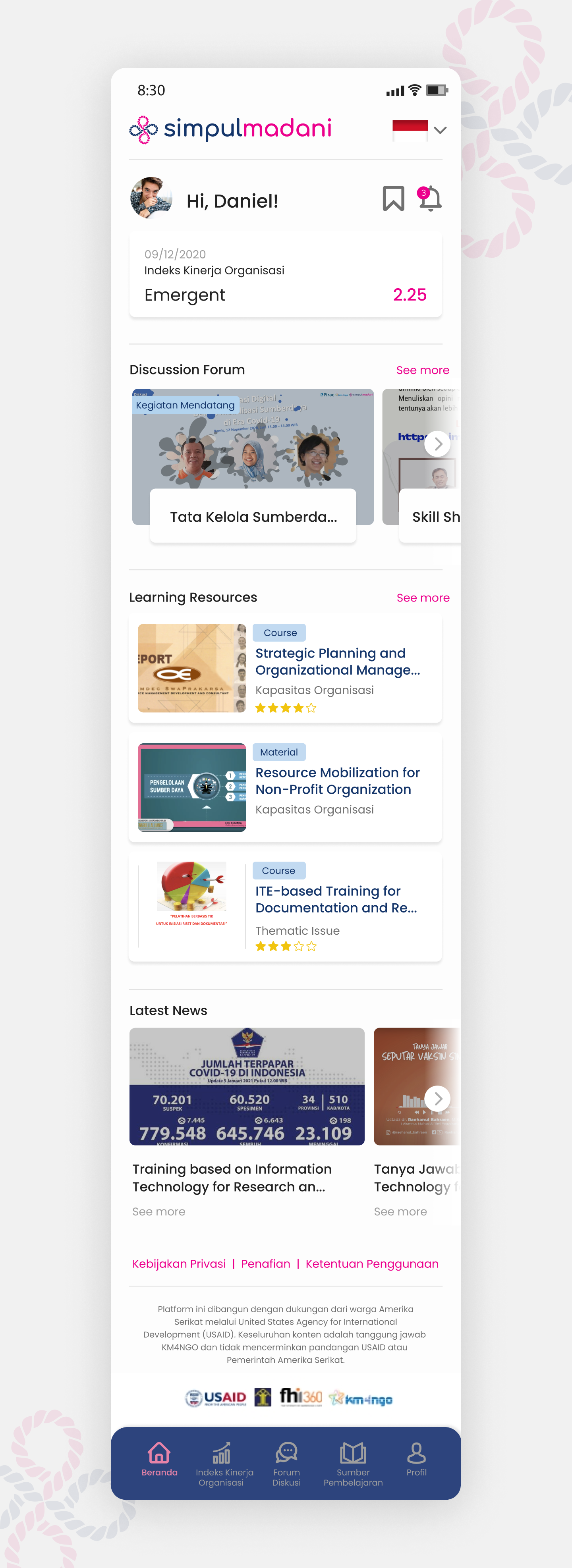
As a locally-driven, open-source Indonesian platform, simpulmadani transcends individual projects, striving to enhance the quality of civil society through innovative learning, knowledge sharing, and collaborative networking. The name "simpul," meaning "knot," symbolizes connection, while "madani" reflects the vision of a democratic, autonomous, and empowered society. The all-lowercase, spaceless writing style represents the ethos of an egalitarian community.
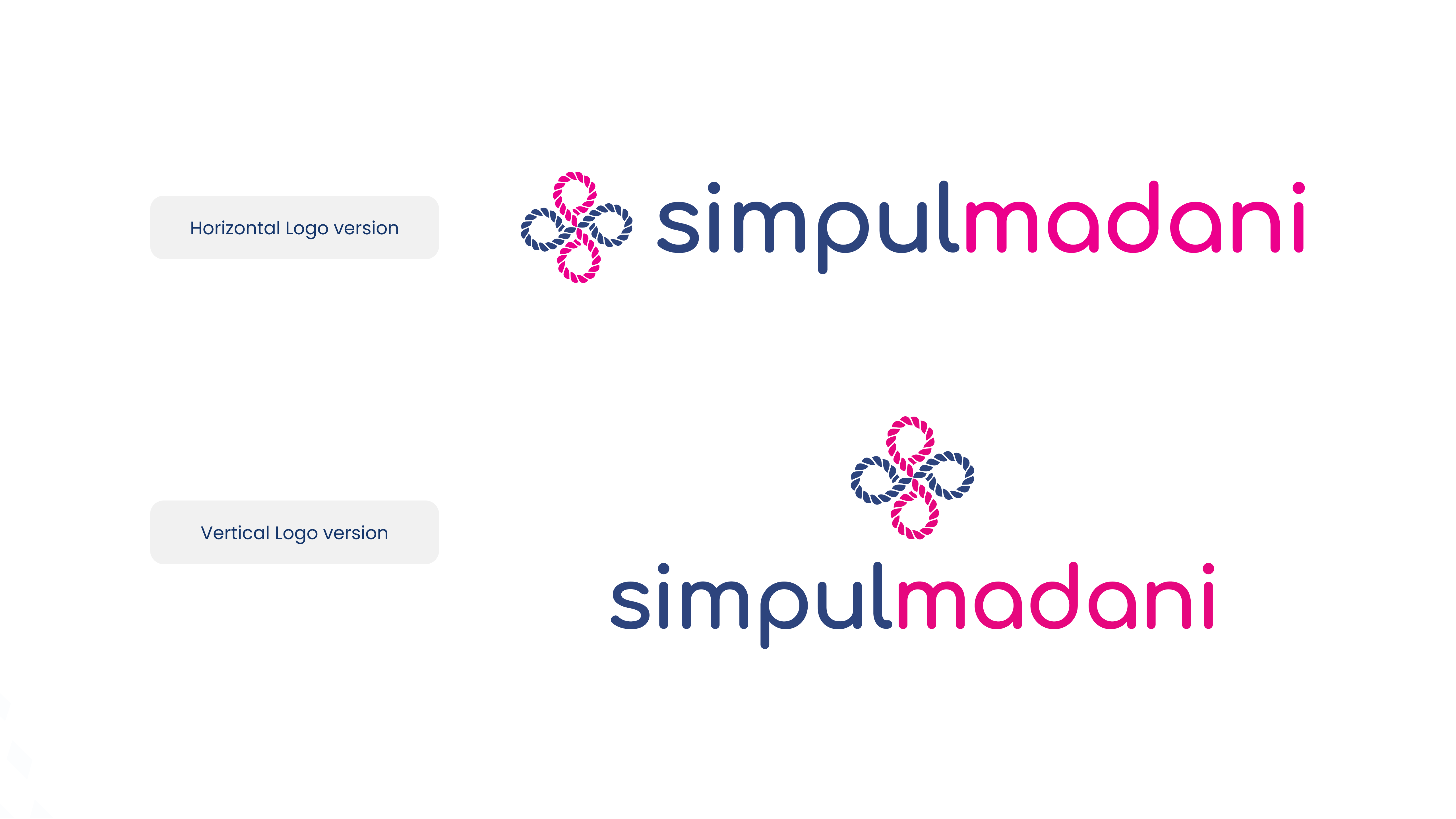
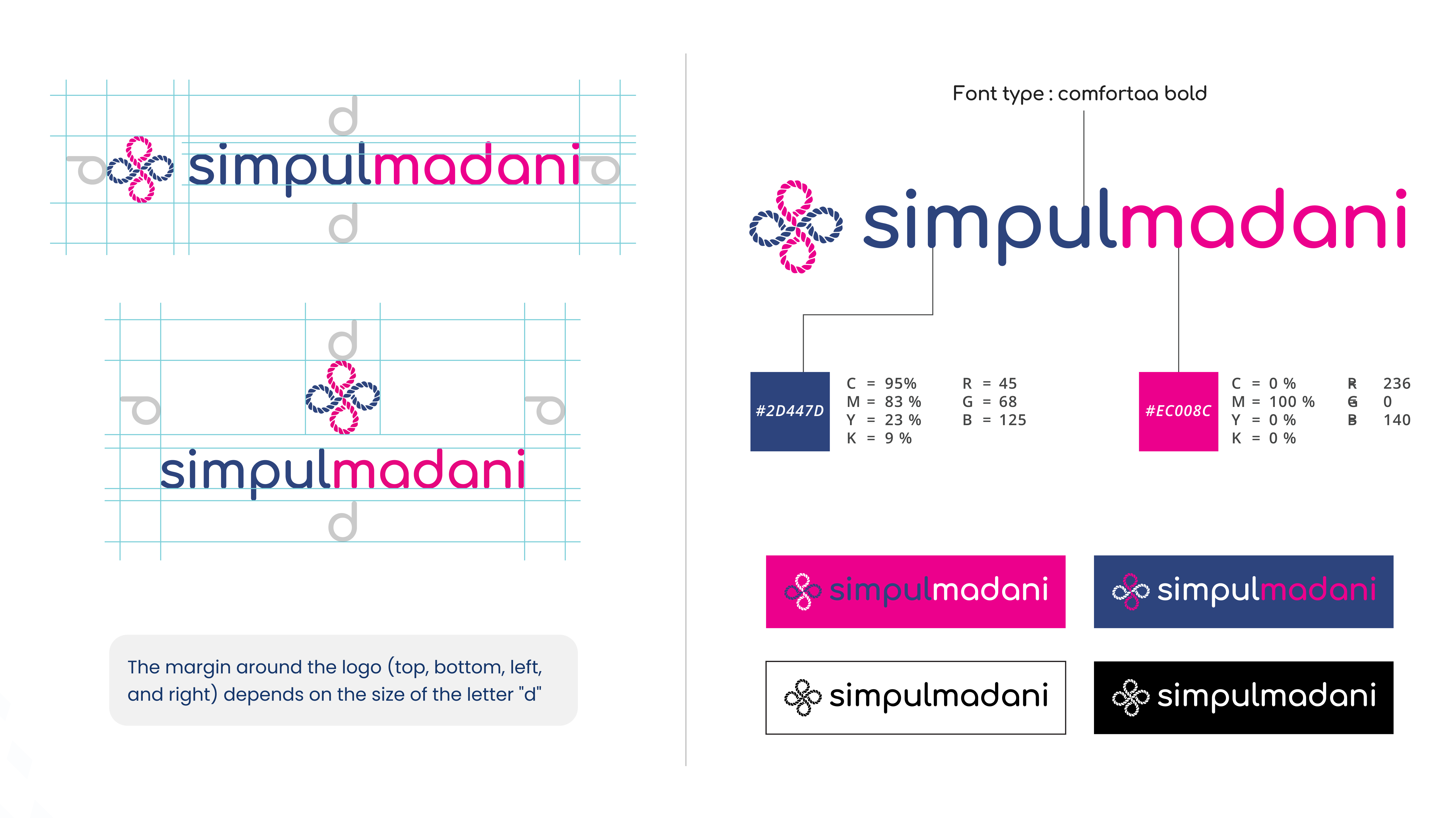
The brand embraces a clean, minimalist, and lightweight design to highlight the unique identity of simpulmadani. The logo features a knot shaped like a four-cornered flower combined with an infinity symbol, representing the vision of a collaborative, accessible, and sustainable platform for individuals and organizations in Indonesia and beyond.
The typography features a rounded geometric sans-serif design, embodying the values of comfort and user-centeredness. The two contrasting colors emphasize the balanced approach of this open-source platform: navy blue symbolizes integrity and trust among stakeholders, including users, while magenta represents innovation and imagination, driving progress and forward-thinking.
The colors used are a combination of those from the logos of KM4NGO, FHI 360 MADANI, USAID, and Saraswati.
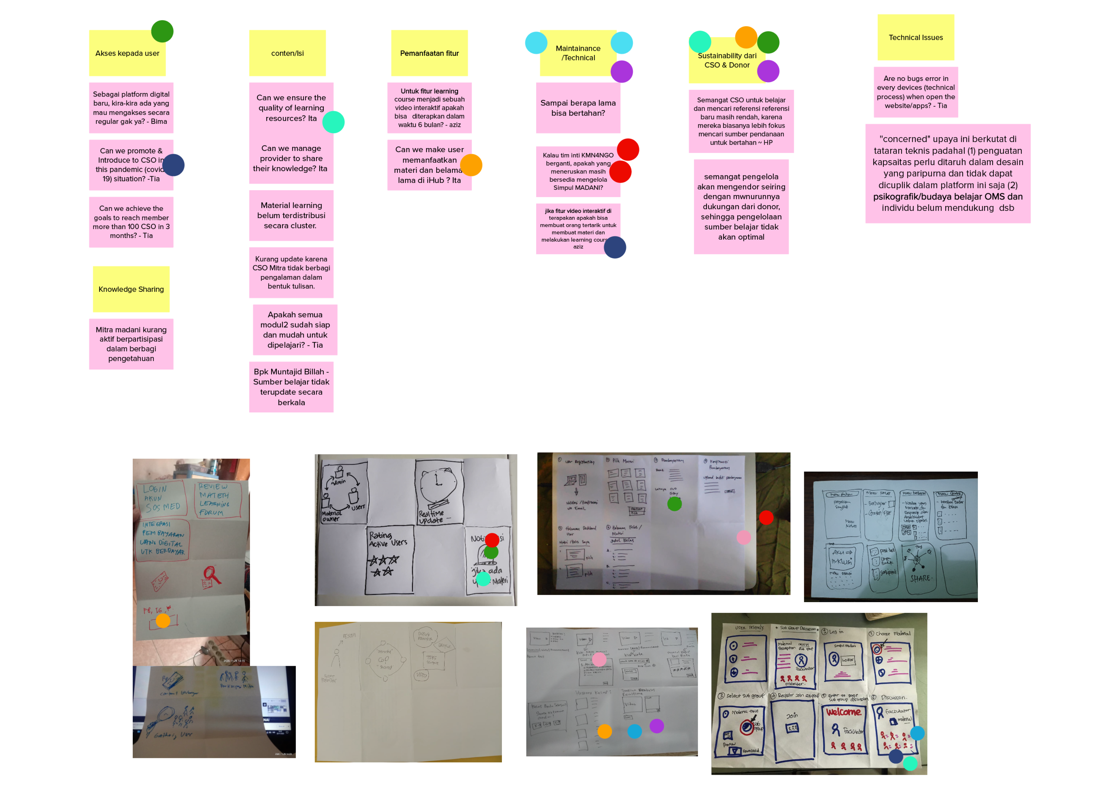
A collaborative process to rapidly generate, prototype, and validate innovative solutions. Using techniques like Crazy 8, participants sketch eight ideas in eight minutes, fostering creativity and refining concepts during the sprint.
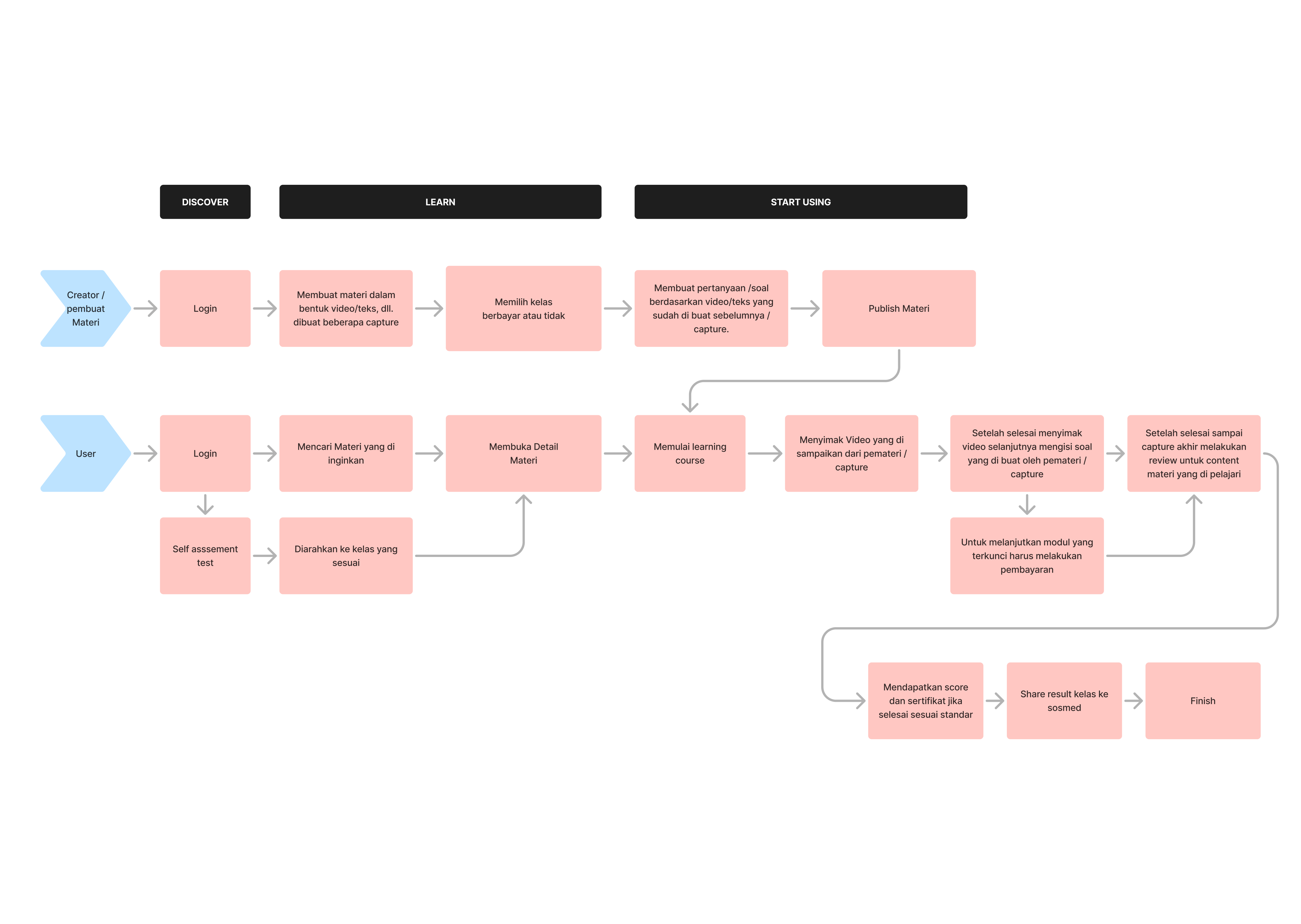
Analyzing user needs, behaviors, and goals to create a seamless journey through a website. This process ensures that navigation is intuitive, tasks are easy to complete, and the overall design aligns with user expectations and business objectives.
Early wireframes led to interactive prototypes, which were tested and iterated on. This phase was crucial for refining user flows and interface elements.
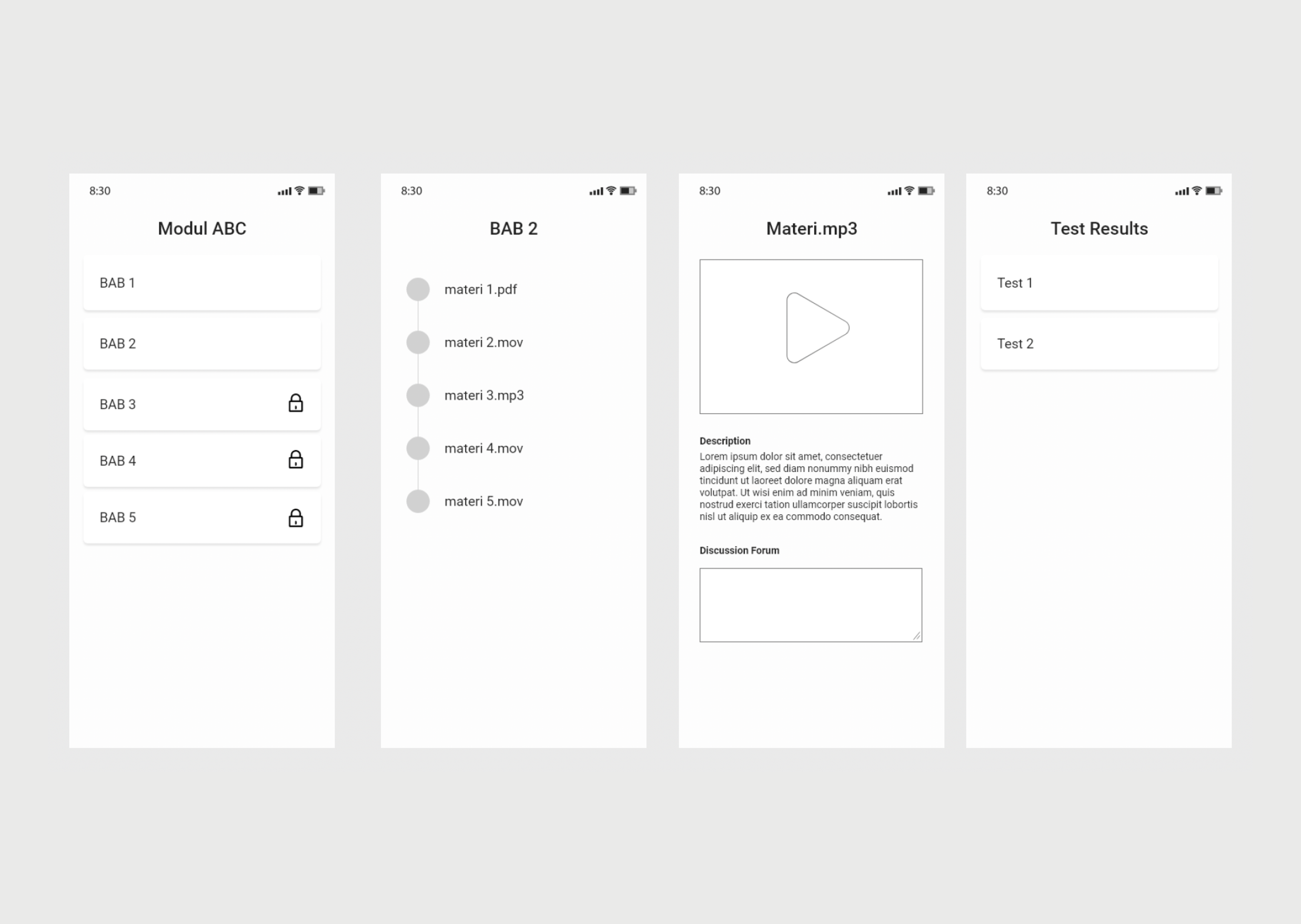
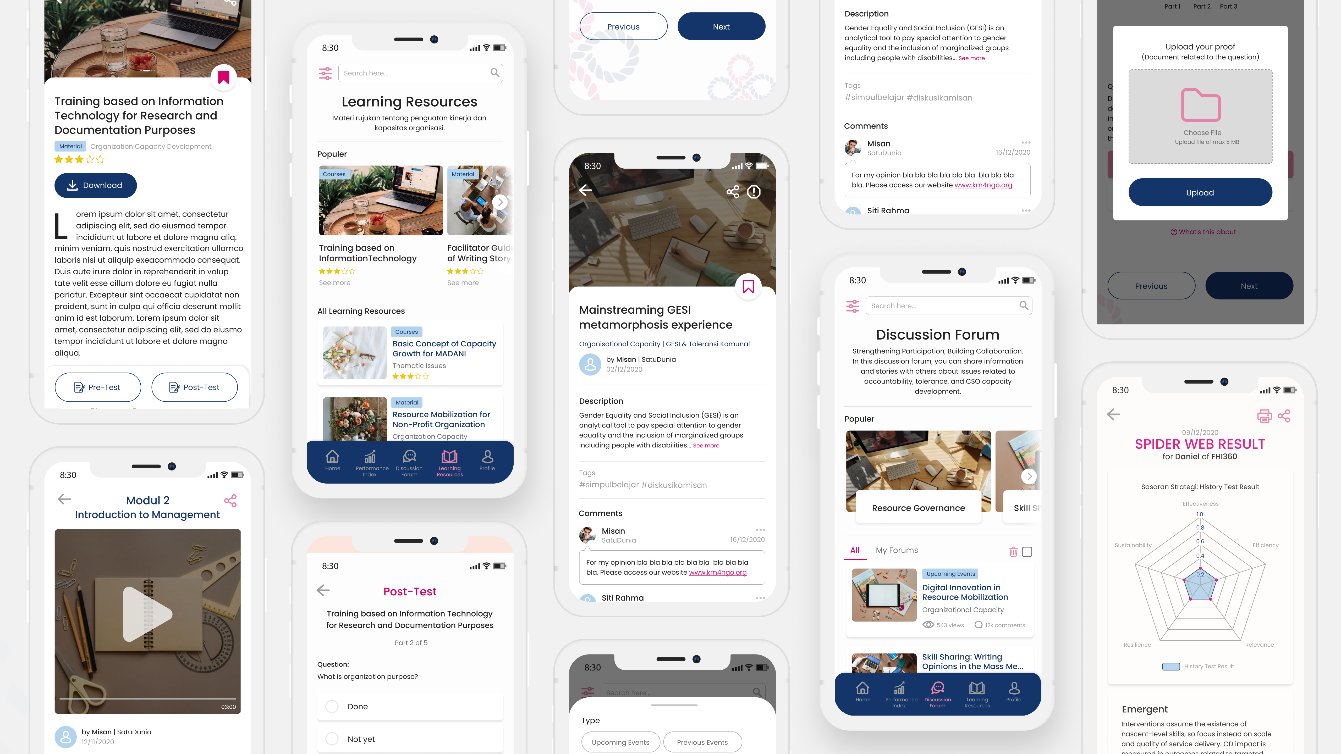
Focused on creating a visually appealing and emotionally engaging experience. The design incorporated nature-inspired themes, intuitive icons, and an easy-to-navigate layout.
Special attention was given to making the app accessible to all users, including those with disabilities. Features like screen reader compatibility, color blindness modes, and scalable text were included.
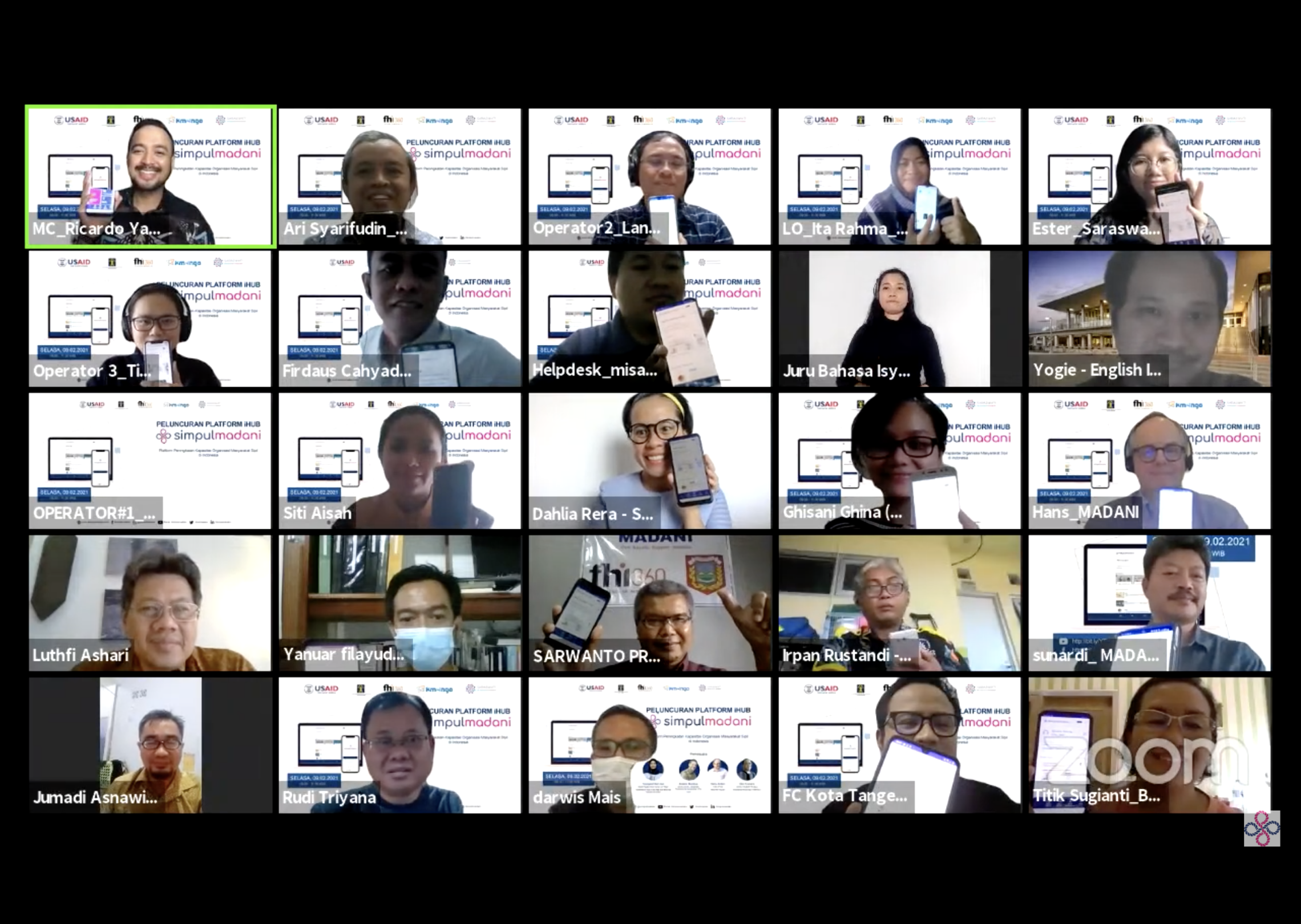
During user testing, participants expressed enthusiasm and satisfaction as the platform enabled interactive discussions and seamless online learning. The opportunity to connect, share insights, and access knowledge in real-time contributed significantly to their positive experience. It emphasizes the collaborative and educational benefits experienced during the testing.
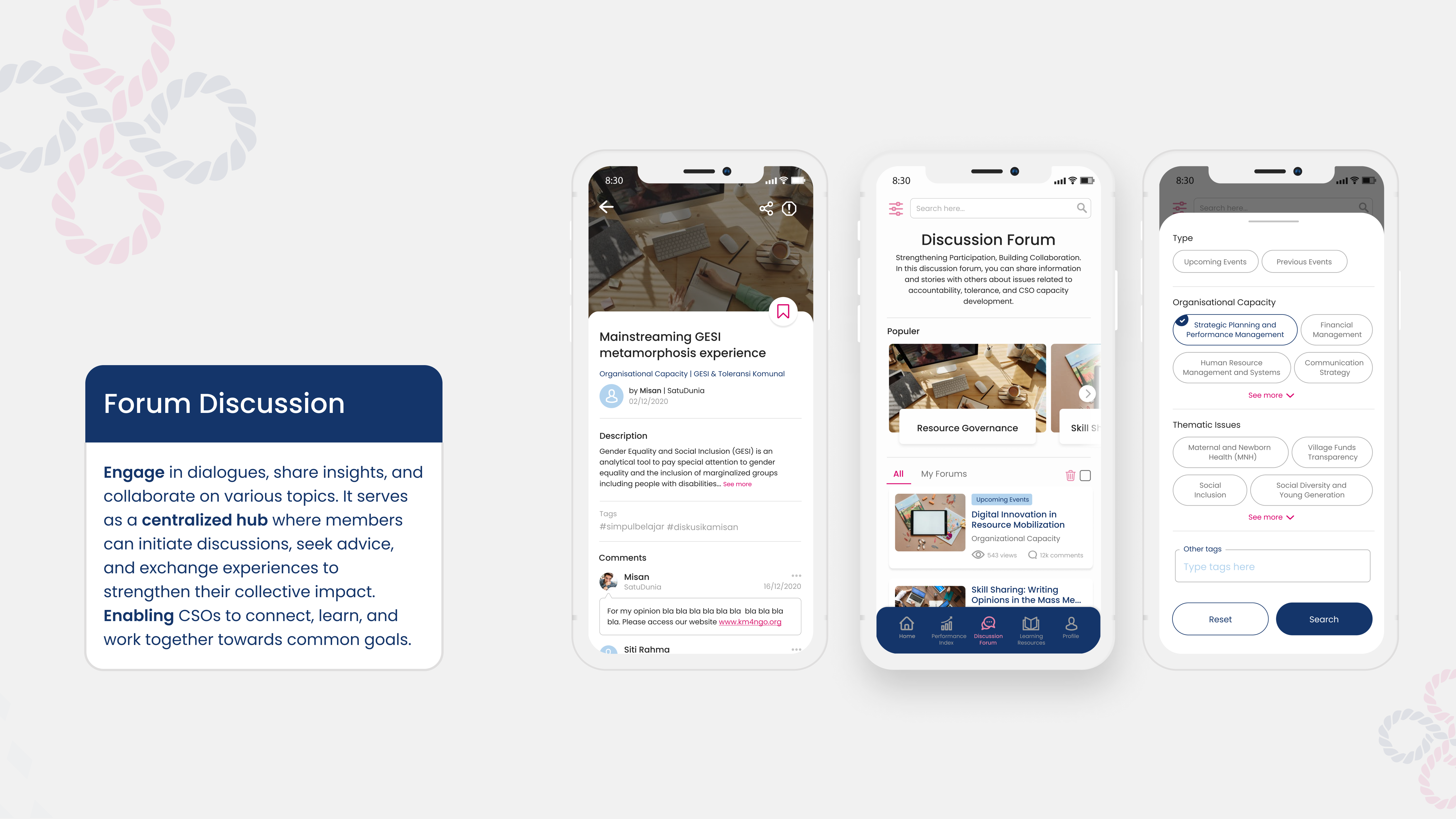
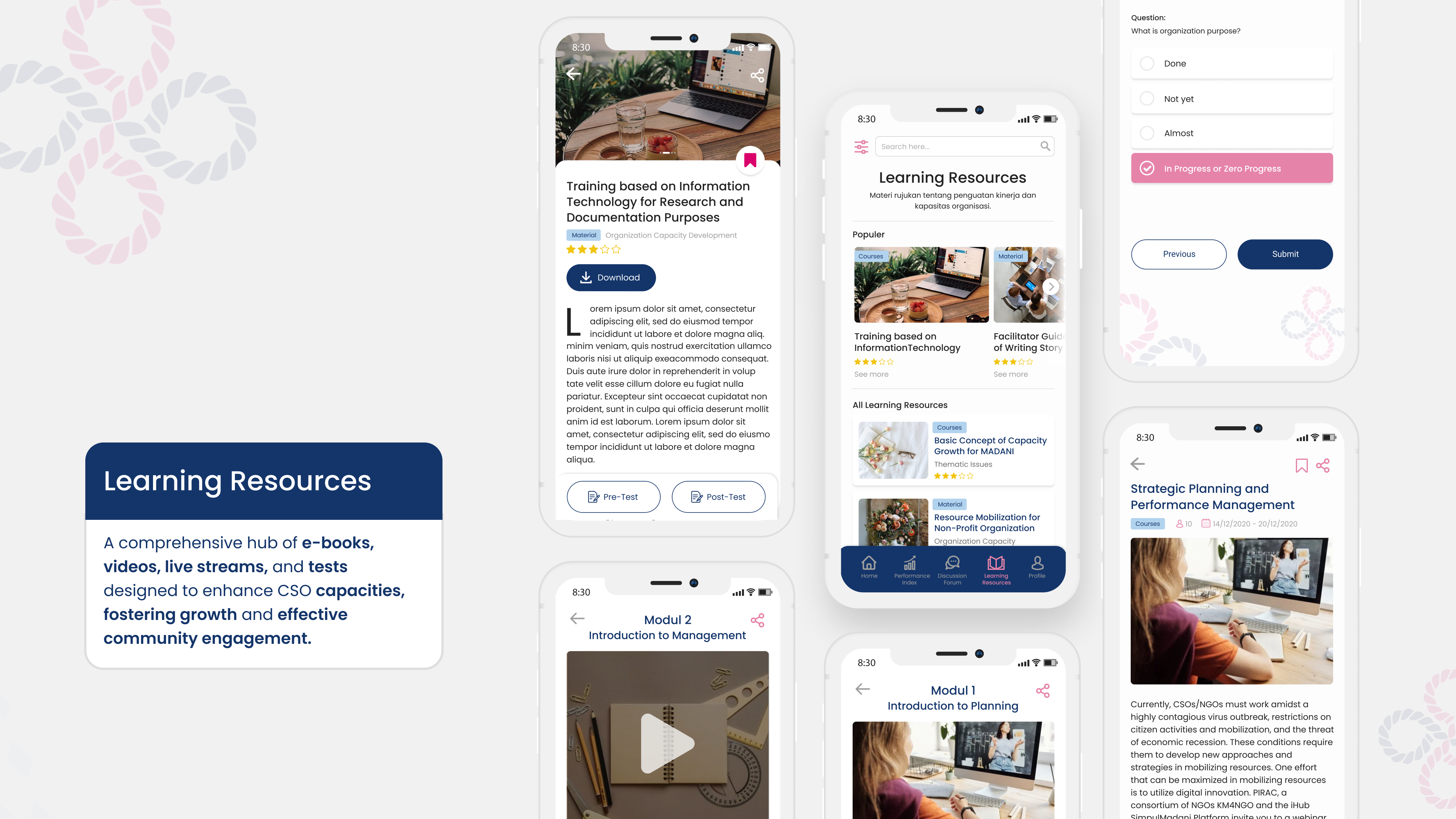
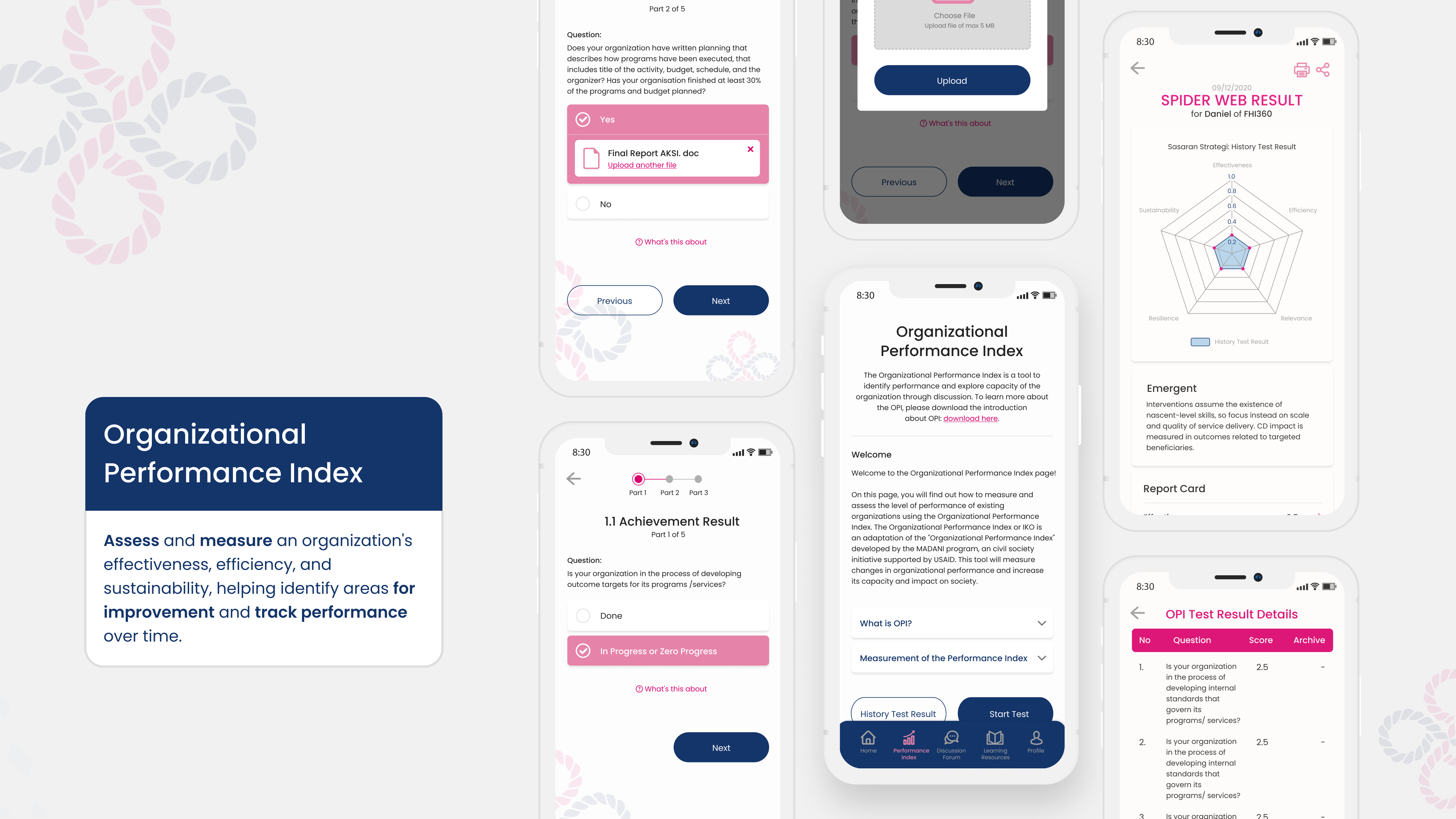
Simplify the navigation by categorizing content such as Learning Resources, Discussion Forums, and Organizational Performance Index, making it more intuitive for users to find relevant materials and engage with the platform.
Create an interactive dashboard for users to easily track their learning progress, participation in discussions, and any tests or certifications completed. This could offer a personalized experience based on user activity.
Optimize the site for mobile devices, ensuring that users can easily access resources, take tests, and participate in discussions on the go.
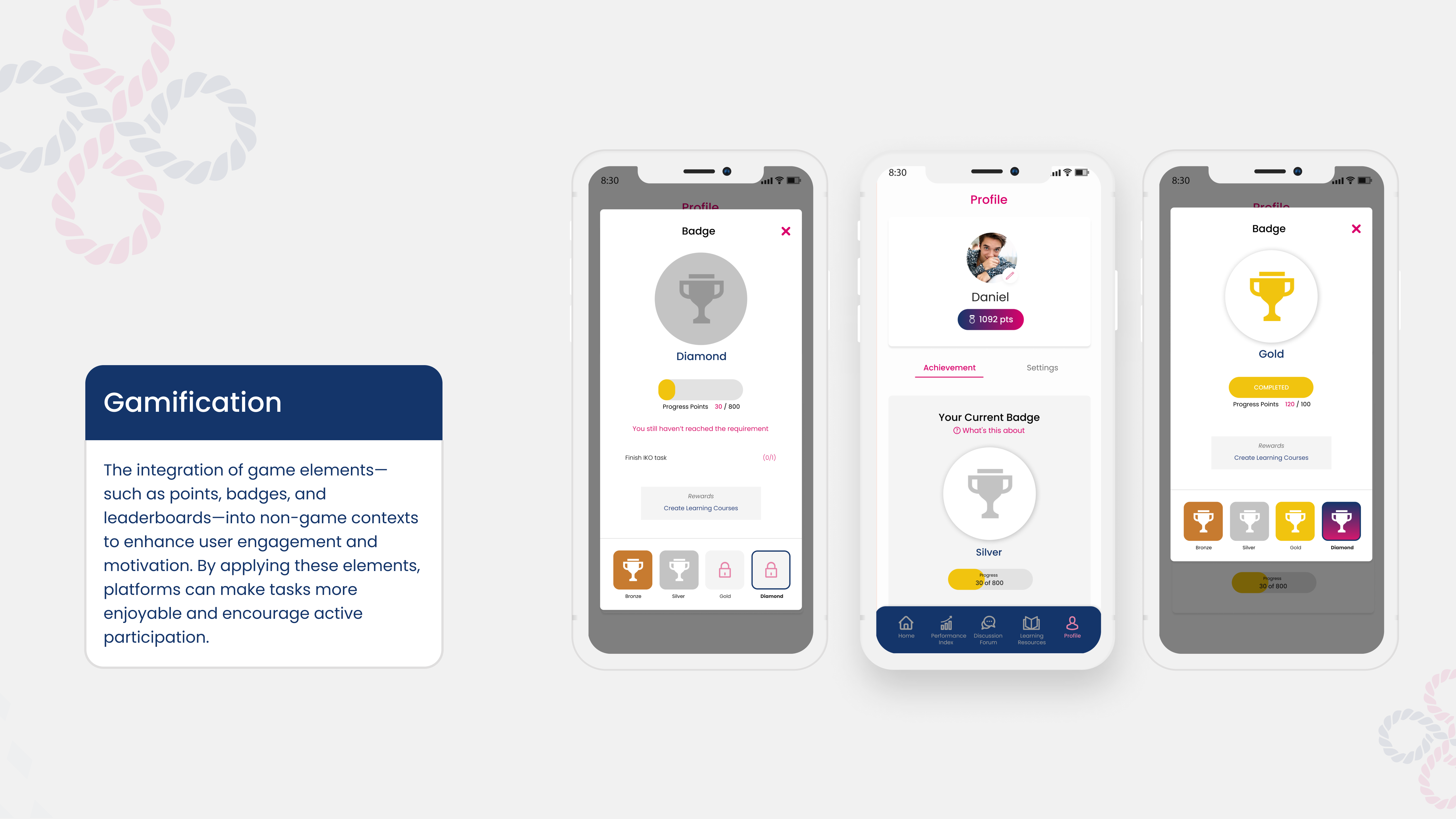
Integrate gamified elements, like badges or leaderboards, to encourage users to engage more with the content and complete learning modules, discussions, or tests.